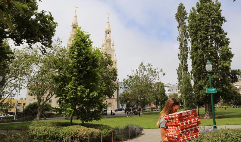
Flour+Water Pizzeria
Building a flagship
When Flour + Water Pizzeria relocated to SF's historic North Beach neighborhood, the team asked us to reimagine the visual identity. The goal was to align with its sister restaurants — Flour + Water and Flour + Water Pasta Shop, which we had recently redesigned — while also giving the pizzeria its own distinctive personality. The branding reflects its quirky, nostalgic, family-friendly neighborhood vibe.
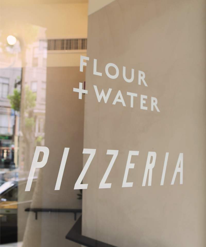
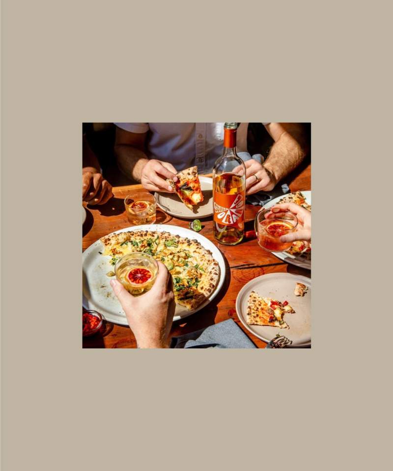
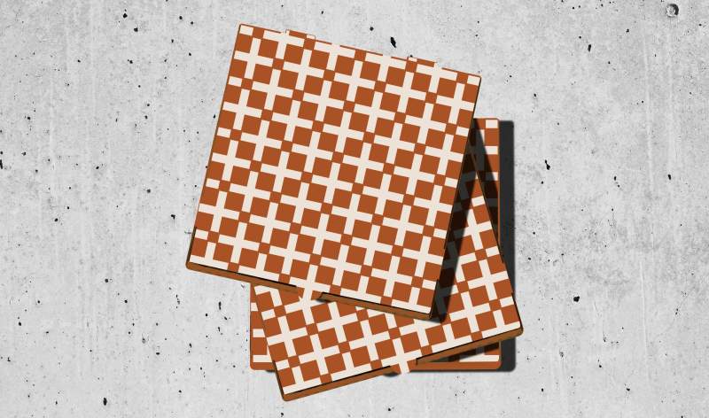
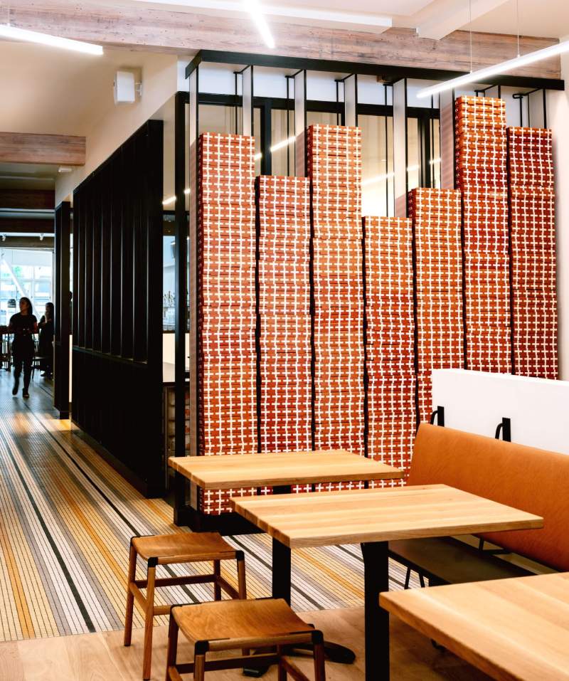
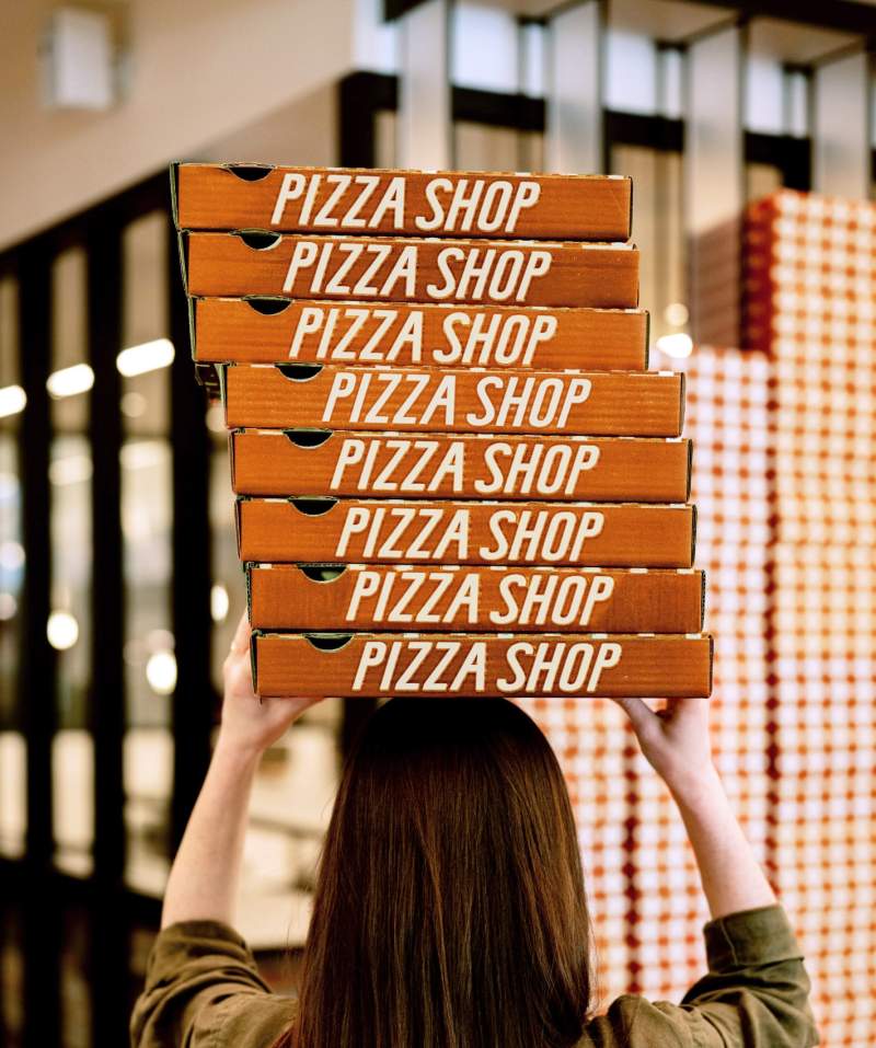
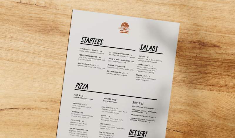
The terra cotta color palette was created to complement the space’s existing striped tile floors. The architects Lundberg Design envisioned a pizza box feature wall, so we designed boxes that would make a bold statement, creating a pattern when stacked. For menus and signage, we created custom letterforms inspired by bespoke mid-century Italian typography.

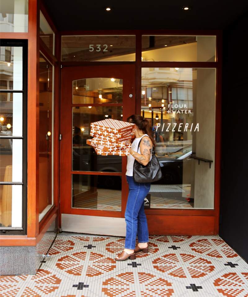
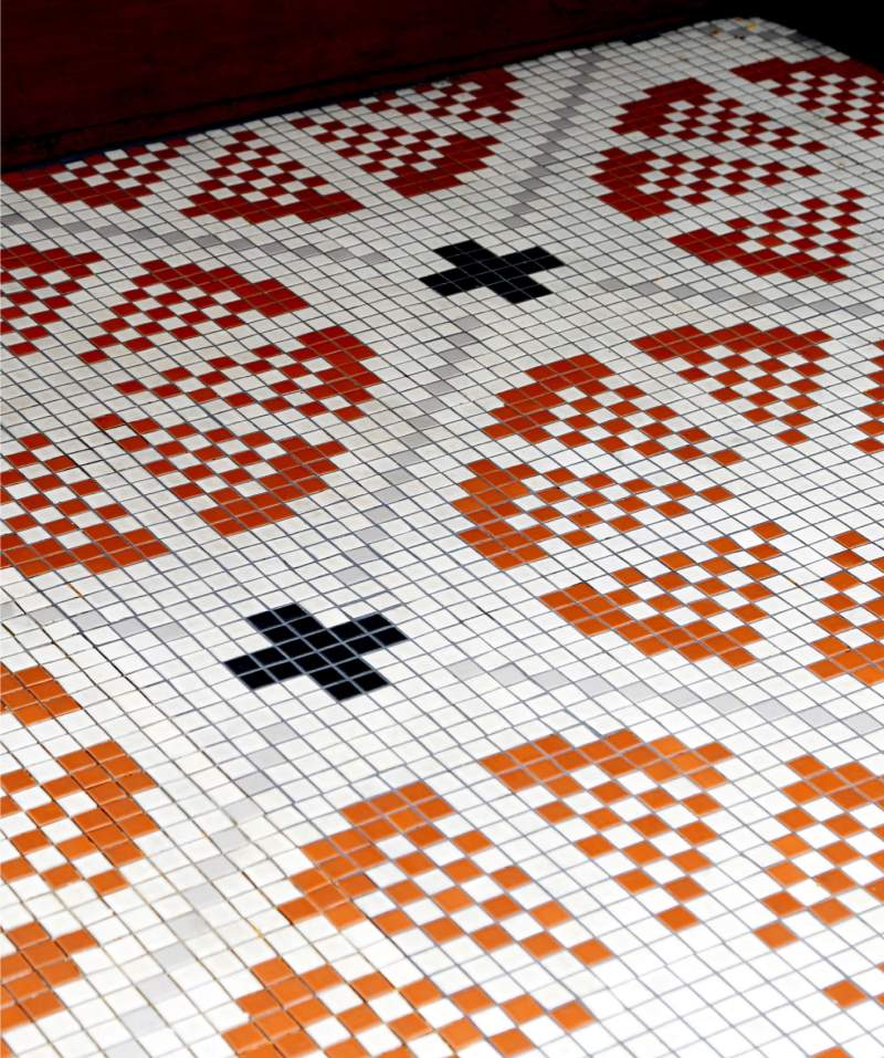
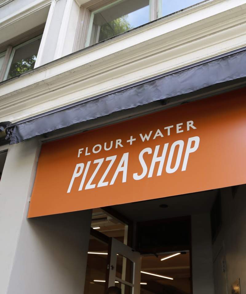
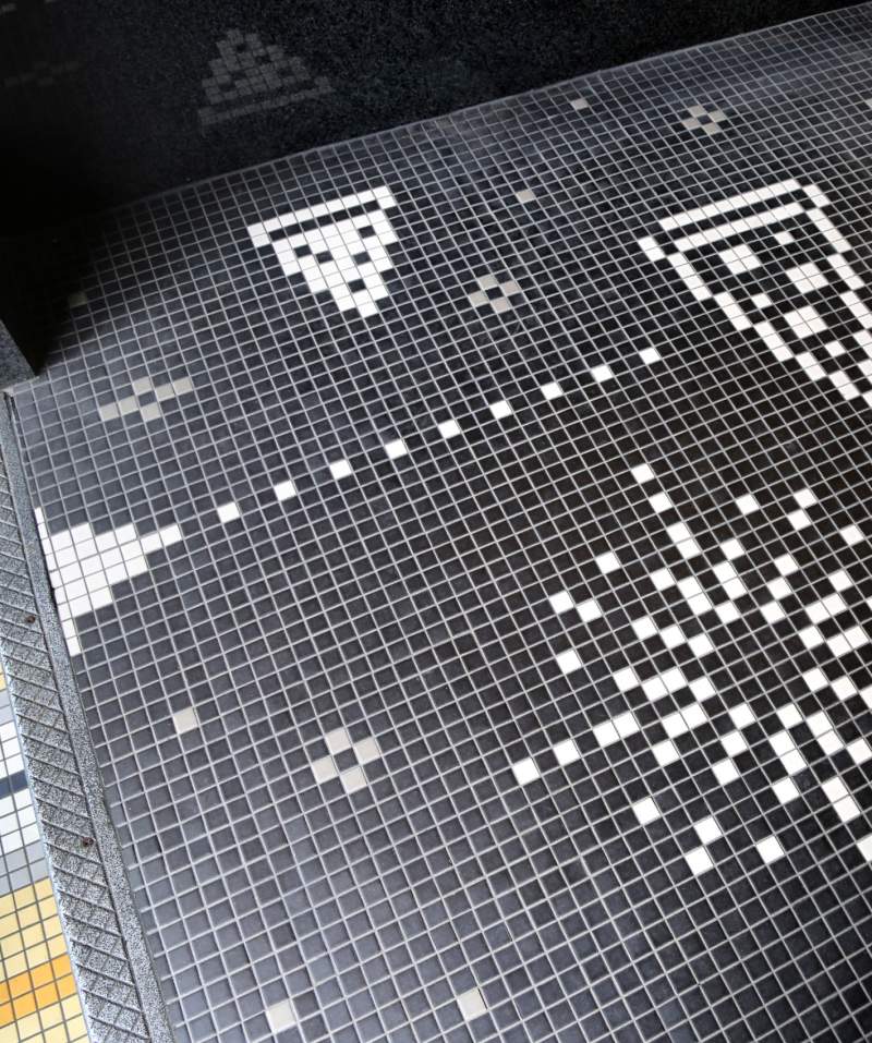
A strategic challenge was to differentiate two distinct, yet connected parts of the restaurant. One is the expansive pizzeria restaurant with table service. The other is a smaller take-out area with counter service and a few seats, where customers can drop in for a “Big Slice” or ”Boozy Slushie” of the day and play a ‘90s arcade game. The team anticipates opening additional to-go outposts throughout the Bay Area and beyond. With this growth strategy in mind, we gave the smaller area its own name: Flour + Water Pizza Shop. To help signal the different experiences, we designed custom signage and tile mosaics for the separate entrances: a pizza and “+” pattern for the Pizzeria entrance, and a pizza-space-invaders arcade game for the Pizza Shop.

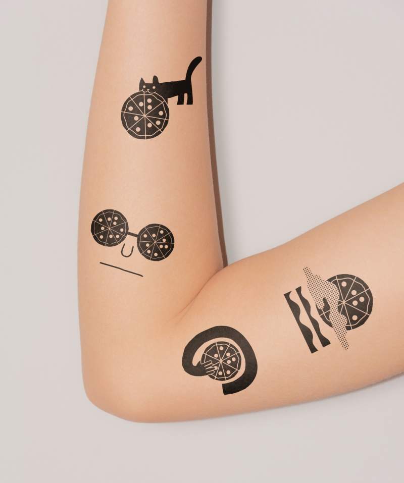


Bringing this brand back to life in a new location was no easy task, but Office was able to communicate our vision in such an extraordinary way. Jason, Jill and their team went above and beyond by taking our crazy ideas about a modern pizzeria and not only turning them into visual identities, but bringing life to our brand.
