Reopening an Original
After 13 years as one of the most-loved restaurants in San Francisco, the iconic Flour+Water restaurant has reopened with a new design.
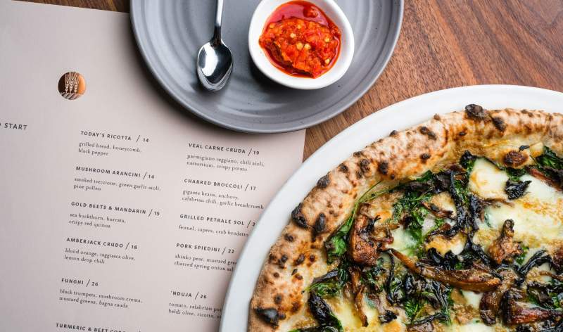
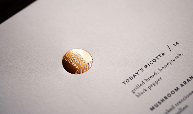
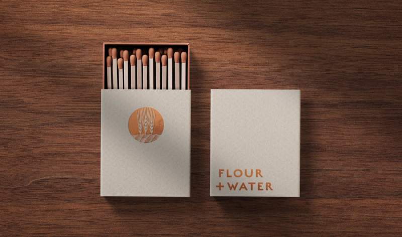
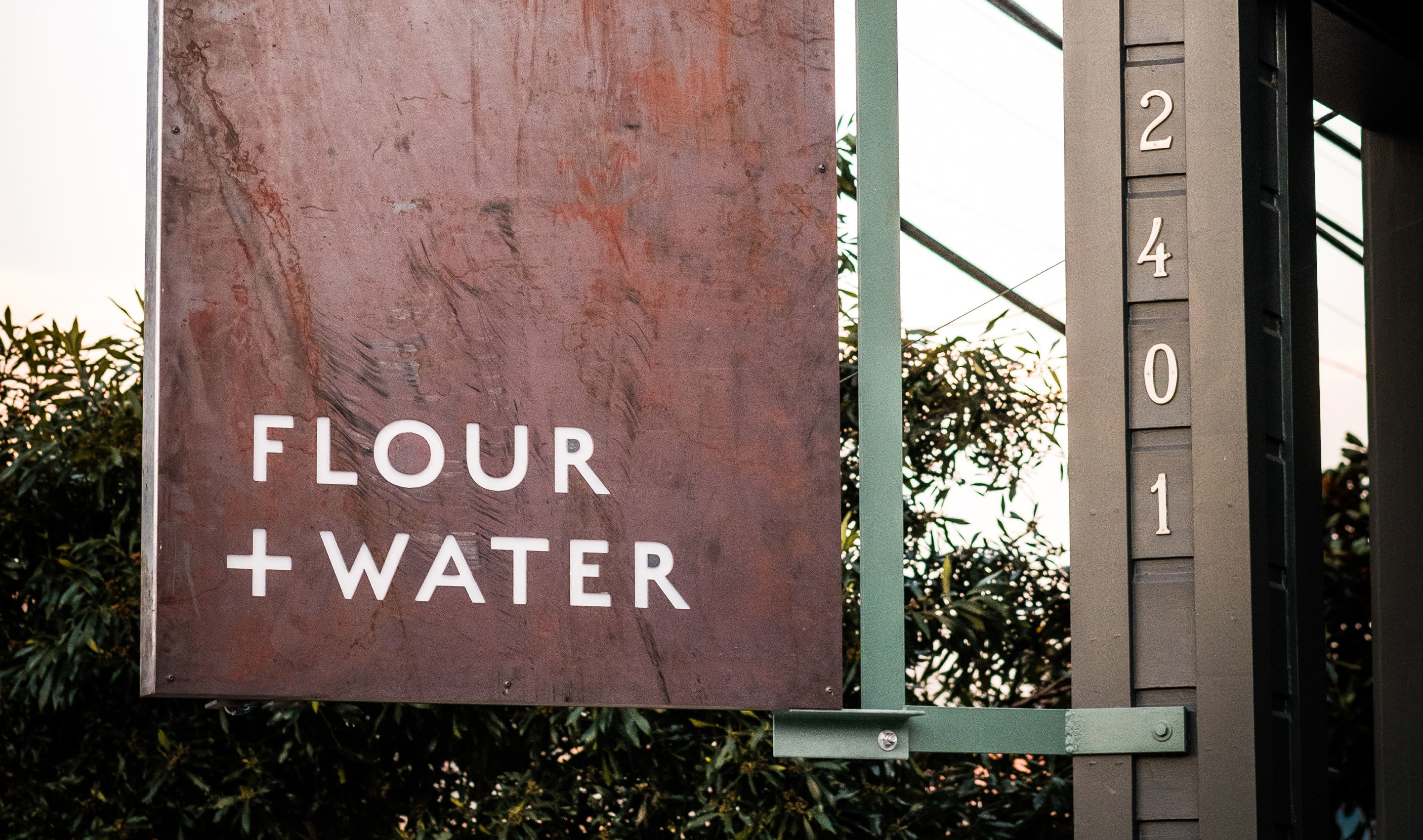
The Flour+Water experience is unique — the music’s a little loud, the vibe is casual, the service is exceptional, and the food is some of the best we’ve ever tasted. Reflecting this unusual combination, Office created a simple logotype, muted color palette with pops of metallic copper, and a secondary mark of wheat + water — hand-drawn and textural to signal the handcrafted approach to food.
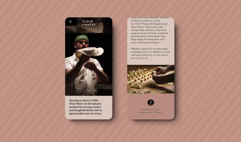
While executive chefs Thomas McNaughton and Ryan Pollnow are influenced by Italian traditions, Flour+Water is known for its distinctly modern California perspective. That classic and modern balance comes through, resulting in an identity that’s both relevant and timeless. This approach aligns with the restaurant’s interiors, reimagined by Lundberg Design.
“I’m so blown away with the work Office did to reimagine our brand,” said Chef Thomas. “Always a little nervous changing something that has been so loved for 13 years. They nailed it.”
Flour+Water is part of the Flour + Water Hospitality Group family of restaurants. Office also helped the group launch Penny Roma and re-imagine the Flour+Water Pasta Shop.