Stanford Children’s Health
Repositioning a leader
Lucile Packard Children’s Hospital at Stanford is a world-class organization that’s grown beyond a hospital to become a broad network of healthcare providers in dozens of locations across Northern California.
New name; new purpose
To better represent its breadth, Office helped rename and reposition the organization as "Stanford Children’s Health,” and articulated the organization’s purpose: to help families live healthier, happy lives.
The new logo reflects the organization’s affiliation with Stanford Medicine, while retaining some equity from their previous mark. To emphasize that unlike Stanford Medicine, SCH is an organization focused solely on kids, we built a library of emotional photography and playful visual elements, while still maintaining the credibility of a leading healthcare provider.
Working closely with SCH, we helped relaunch the organization’s website with new visual design and content that establishes SCH as a worldwide resource for families.
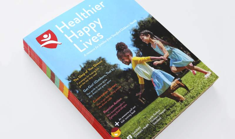
A resource for families
To introduce Stanford Children's Health as the healthcare resource for families in the region, Office concepted and produced a print publication that was sent to all homes with kids across the Bay Area. The 48-page resource included stories and practical tips on health and wellness, incorporated the latest discoveries in research from world-renowned Stanford doctors, and featured a removable activity book just for kids.
To further build connections with Bay Area families, we developed an experiential marketing plan with local event sponsorships.

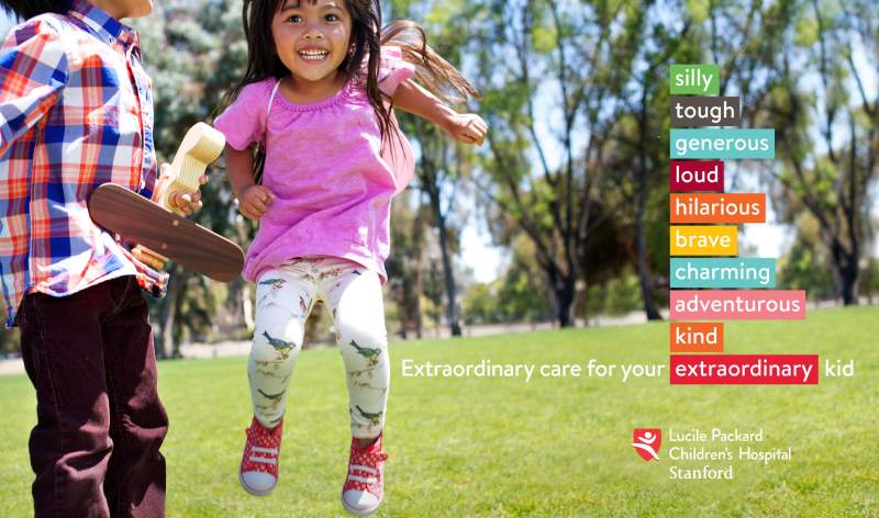
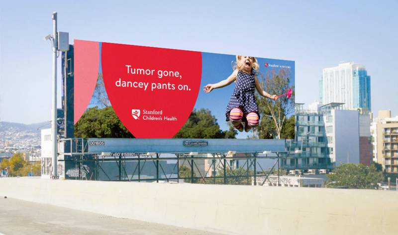
Extraordinary Care for Your Extraordinary Kid
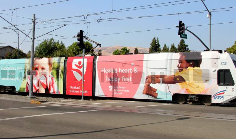
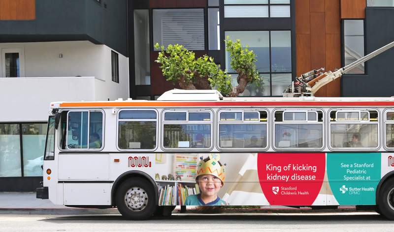
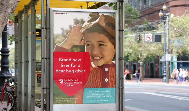
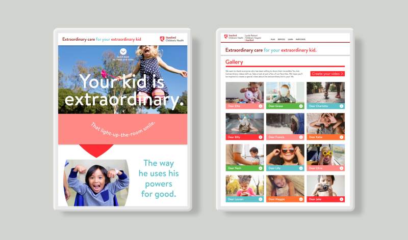
Office created the integrated marketing campaign “Extraordinary Care for Your Extraordinary Kid” to introduce the new brand in a way that demonstrates that Stanford Children’s Health gets what’s most important to parents — providing exceptional care for the most important people in their life. The ads wove relatable moments and positive healthcare outcomes into emotional stories based on those universal emotions of love, hope and pride that every parent feels for their child. TV and radio spots, and outdoor, digital and print ads emphasized what makes SCH’s care extraordinary.

An innovative element of the campaign was an interactive tool that allowed families to create and share personalized video messages for their kids, featuring their own photos and warm-hearted messages.
Following the campaign, brand awareness of Stanford Children’s Health increased 41 percent and preference increased 39 percent.
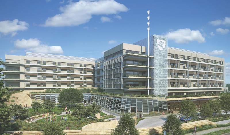
The hospital of the future
The new branding happened simultaneously with a $1 billion hospital expansion. SCH built one of the most technologically advanced, family-friendly and sustainable hospitals for kids and pregnant women. Office created a fence wrap and materials to communicate the vision and plans. We recommended naming kids’ hospital rooms facing the construction site “rooms with a view,” and made construction hats, binoculars and activity sheets to celebrate the building’s progress.