Fanta
Refreshing a Global Icon
When The Coca-Cola Company defined a new global vision for Fanta to “create more play in the world,” they engaged Office to bring it to life visually.
Fanta is distributed in 190 countries. The design challenge was to build a system that would visually unify the brand worldwide and also allow for flexibility across individual markets.
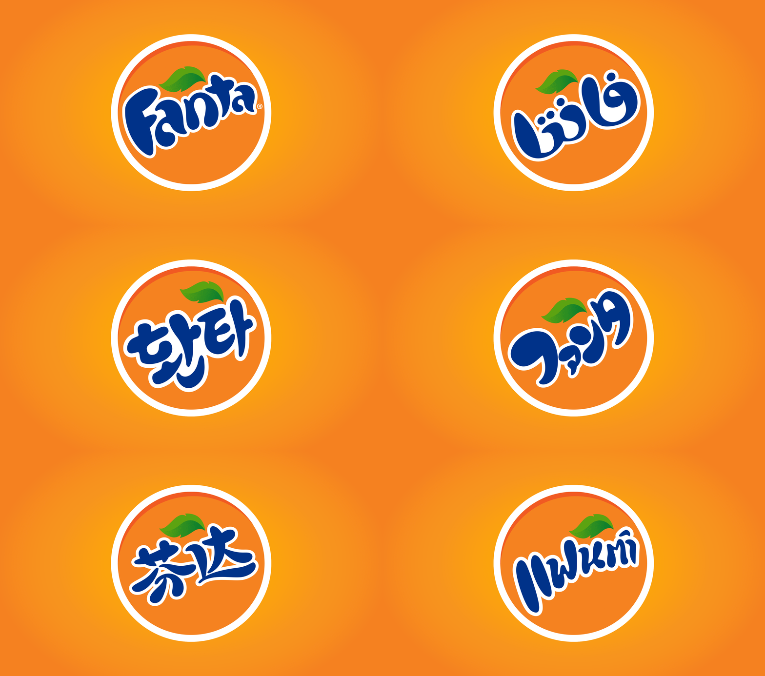
Marketing challenges and opportunities varied across regions, so we started by understanding the different shopping experiences — from bodegas in rural Mexico, to supermarkets in Moscow. We developed a visual brand architecture that defined the brand’s design strategy and approach for all Fanta variants and sub-brands.
The universal language of play
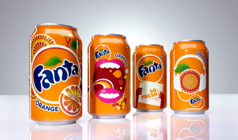
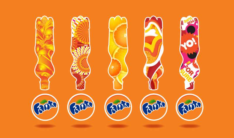
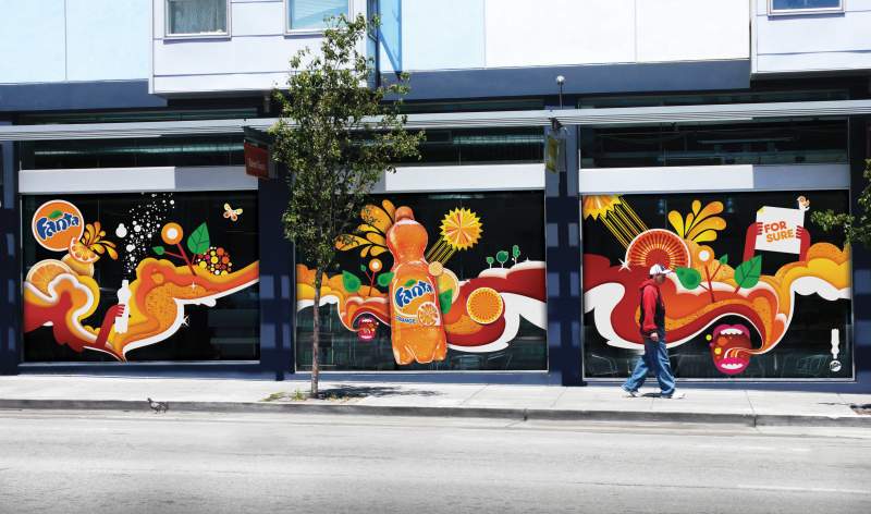
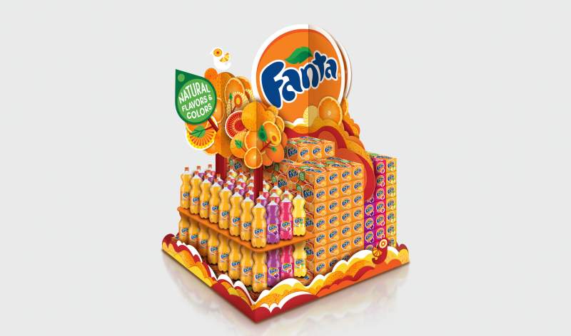
Office infused Fanta's life-is-good spirit and bubbly personality into the entire system — from the new logo, to packaging, to point-of-sale marketing, to lifestyle products and beyond. Rooted in Fanta’s orange heritage, the identity exudes the brand’s sense of playfulness while boldly standing out on shelf. For the launch of the new identity, we created a short film to generate excitement among the Fanta team and bottling partners, which later aired as a TV spot in Mexico.
Comprehensive brand guidelines helped ensure successful implementation, guiding creative agencies and marketing teams across markets. As Fanta implemented the system worldwide, Office advised regional teams, providing additional support and direction as needed.


Fanta World: Discovering global flavors
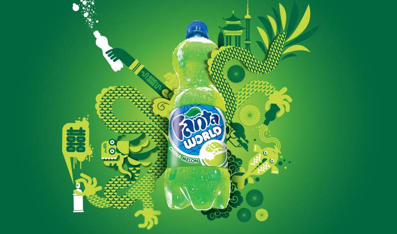
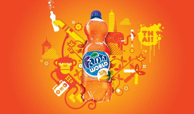
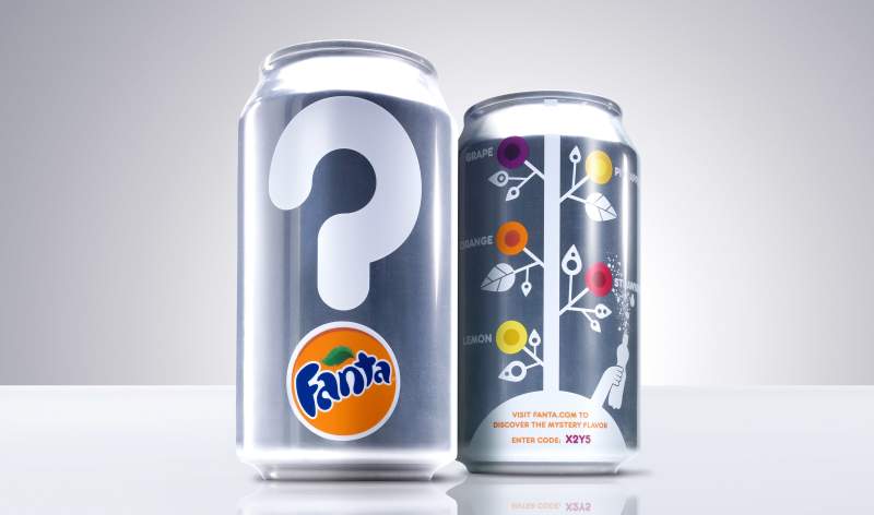
Fanta World introduces limited-edition Fanta flavors from around the globe. Office developed the visual identity system, packaging system and point-of-sale marketing to evoke a sense of adventure and discovery. Playful illustrations represent a specific country and flavor, like Thai Mango and China Melon. And the limited-edition packages have a collectible feel to encourage customers to grab them before they’re gone.
