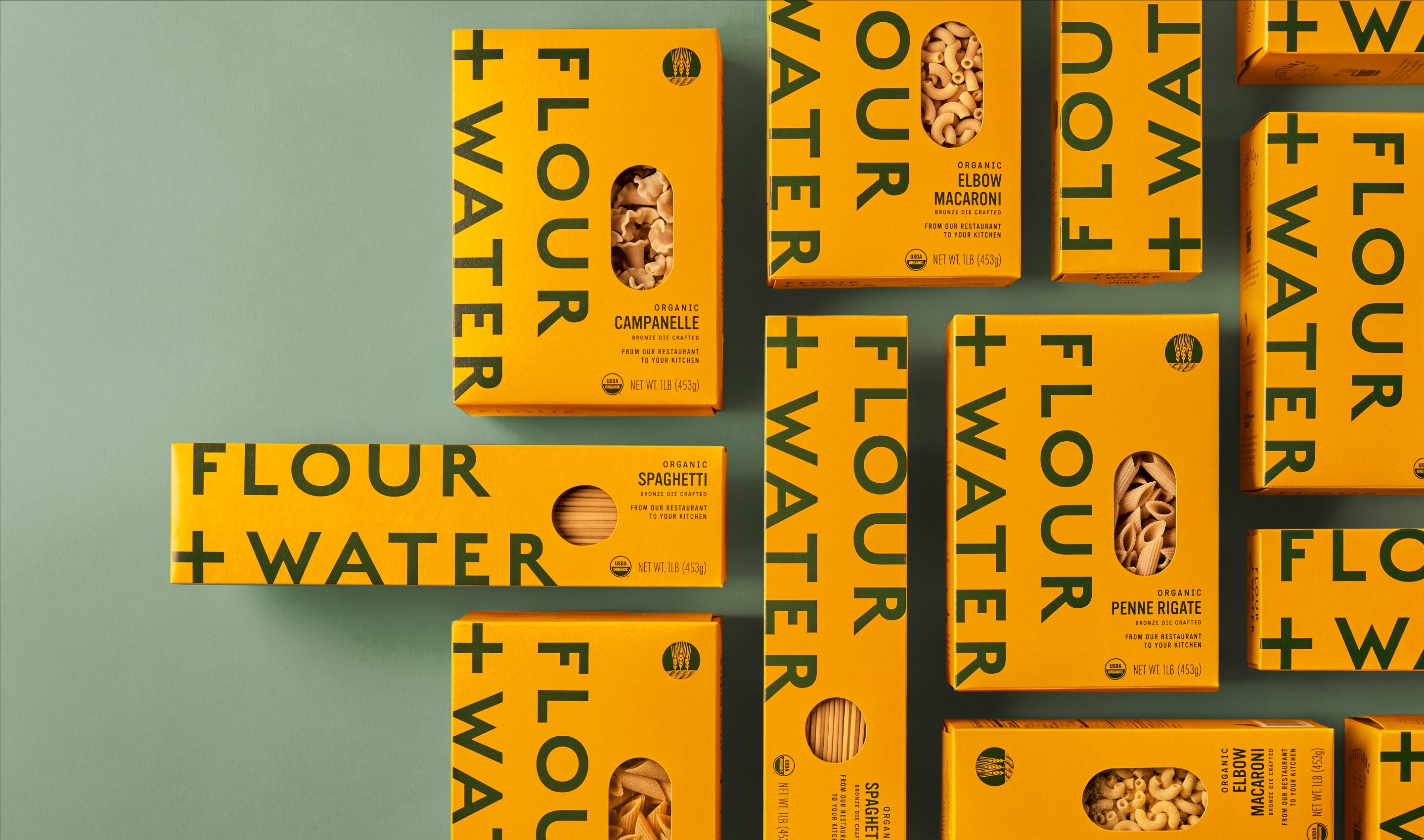
From Flour + Water Restaurant to Your Kitchen
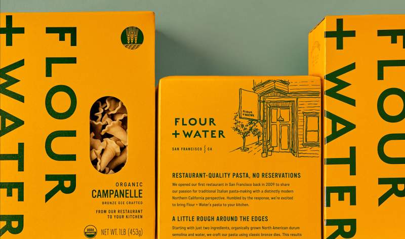
Last year, Flour + Water launched a line of restaurant-quality organic pasta that’s now available in grocery stores and specialty markets across the country. As the business grew, the team asked Office to develop a new packaging system that reinforces the products’ tie to the acclaimed Flour + Water restaurant. We aimed to find new ways to tell their story on pack, while also creating a stronger shelf impact.
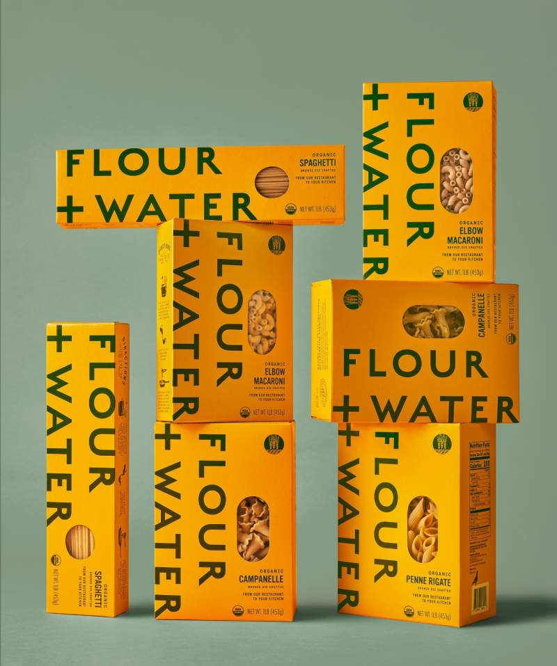
To improve standout and differentiate the brand from competitors, we super-sized the logo, deepened the yellow, and introduced forest green typography. We increased the size of the windows to allow customers to see the pasta shapes with texture that comes from using traditional bronze dies. The new packs make a bold impact on shelf, creating an especially strong Flour + Water brand presence when merchandised together.
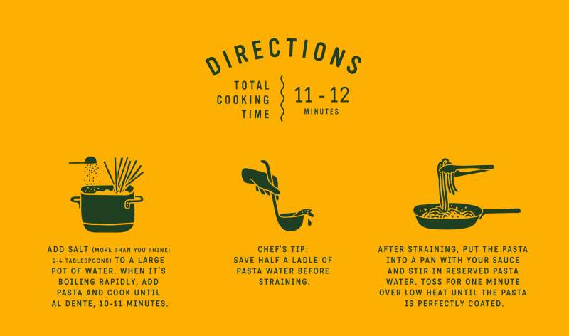
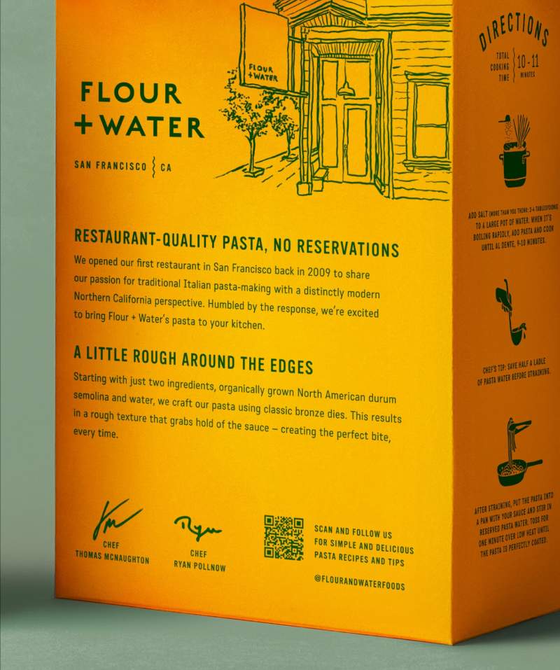
As a nod to the product’s origins, we added “from our restaurant, to your kitchen” to the front of pack. The back panel features a hand-drawn illustration of the restaurant exterior along with the story behind Flour + Water pasta. Incorporating signatures from Chefs Thomas McNaughton and Ryan Pollnow, as well as a QR code to access their recipes, creates a personal connection back to the restaurant. Cooking instructions include hand-drawn illustrations and chefs' tips, to further reinforce the quality of the crafted pasta.
