When the Building is the Brand
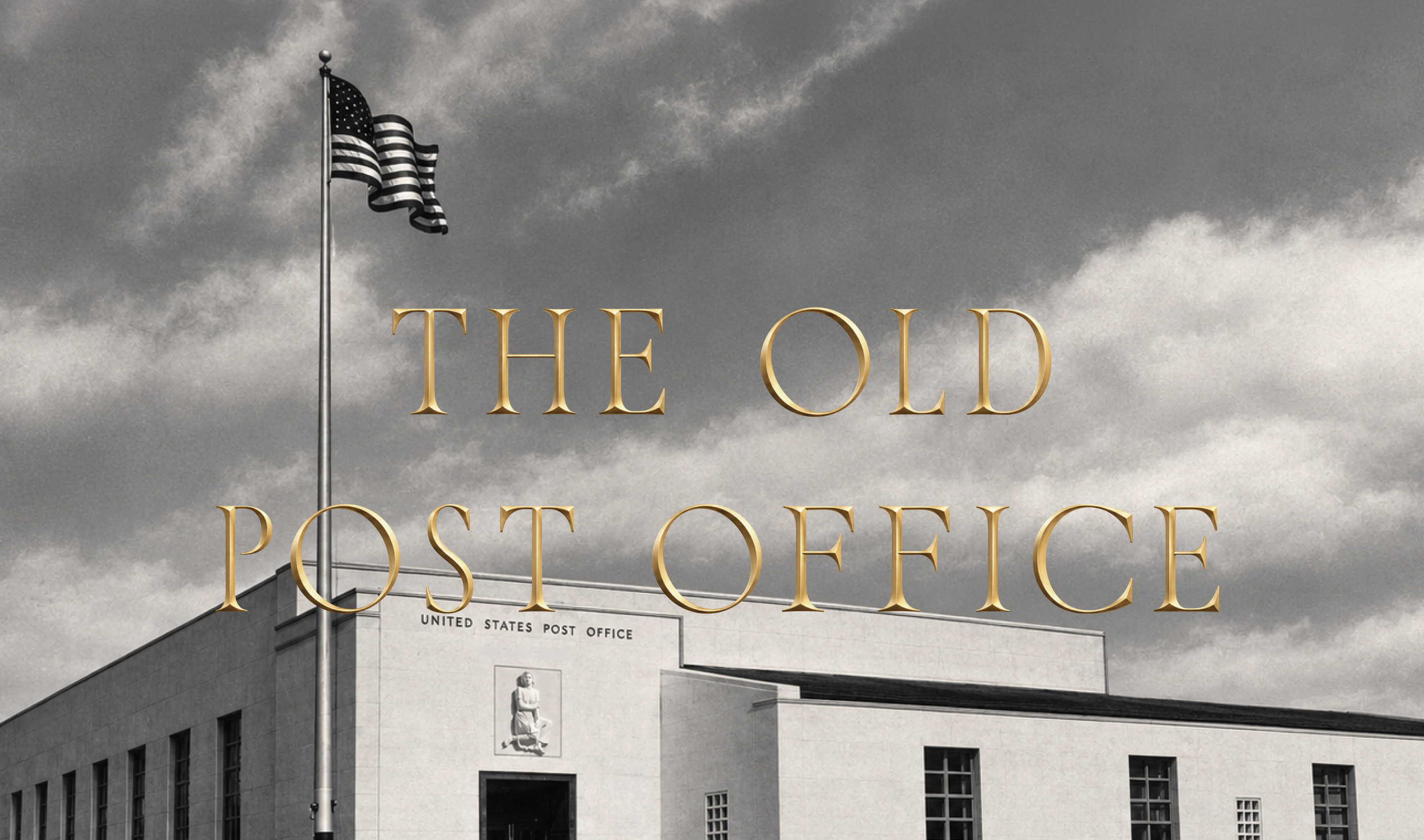
For more than 70 years, Burlingame’s post office was a fixture of downtown. Then it closed, and the historic building sat unused for years. Now, following an extensive restoration, the landmark has reopened as The Old Post Office, a new fine dining restaurant from Bacchus Management Group.
Office created the visual identity by starting with what was already there. By looking closely at the architecture, signage and artifacts that had defined the building for decades, we uncovered a visual language with the character and range to become something new.
A custom TOPO monogram gives the restaurant a shorthand signature, appearing across the identity and pressed into the ice of a signature cocktail. Monumental lettering found throughout the building became the basis for the restaurant’s typography, preserving the grace and authority of the original. The Letter, James L. Hansen’s cast-stone relief above the original entrance, is embossed into the menu, bringing a piece of the building to every table. The intricate locks of the original brass post office boxes inspired a graphic device that appears throughout the identity.
The visual system also opened up possibilities for how the identity could show up across the restaurant. Concepts for postcards, matchbooks, stationery and custom waitstaff tie clips each draw from the building’s history, creating details that could belong nowhere else.
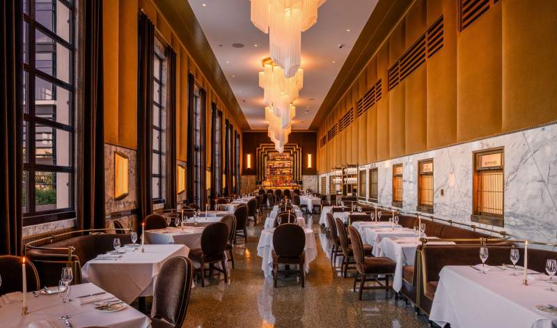
Photo: courtesy of @edandcamera
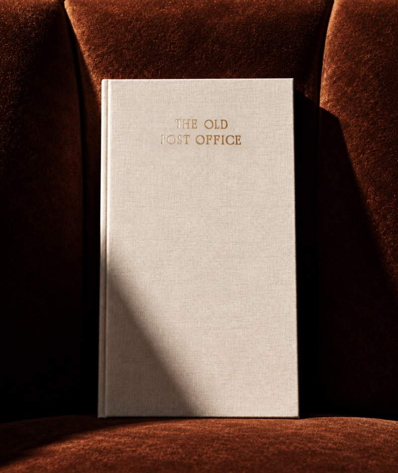
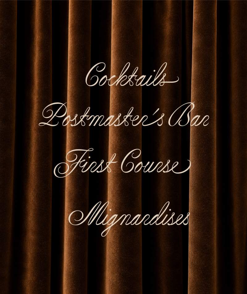
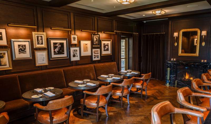
Photo: courtesy of @edandcamera
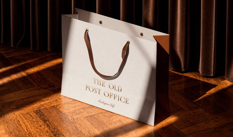
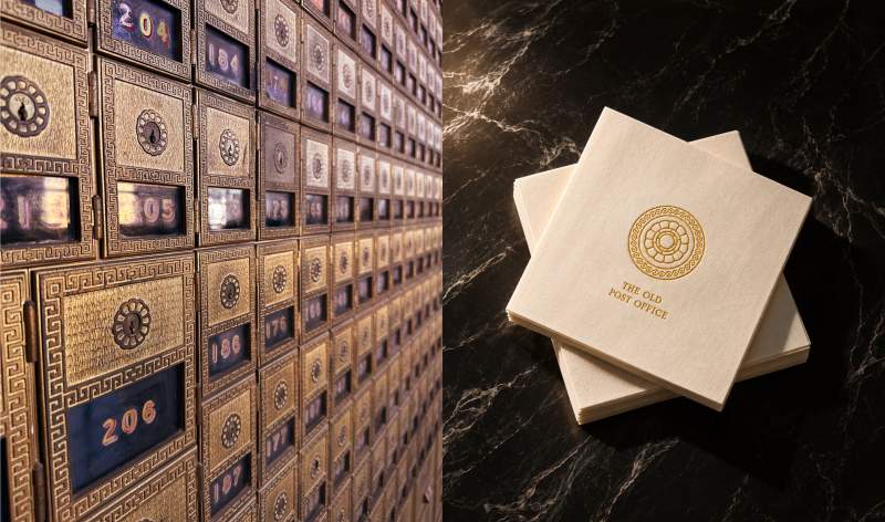
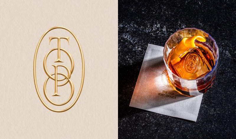
Photo: courtesy of @edandcamera
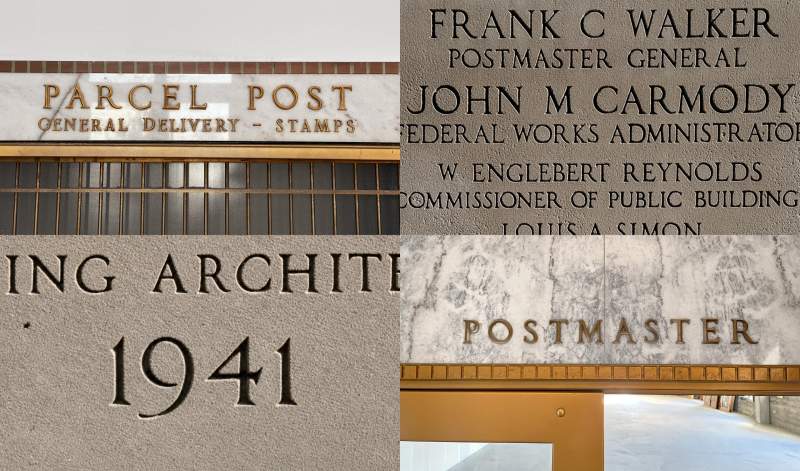
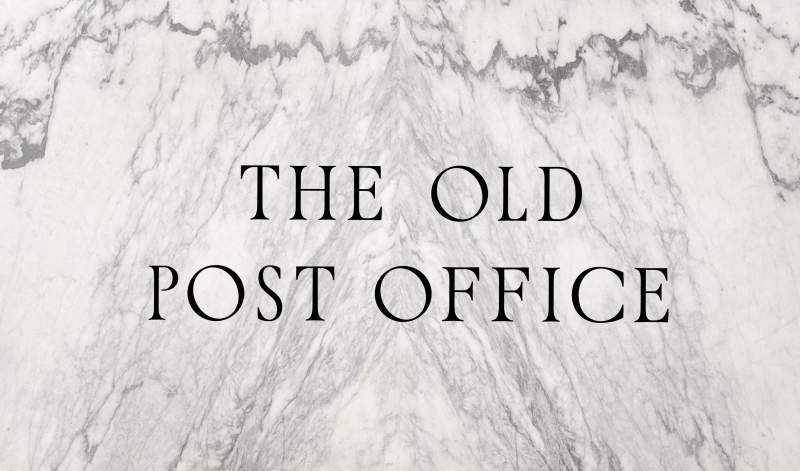
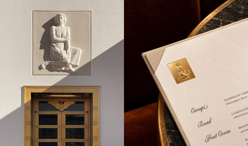
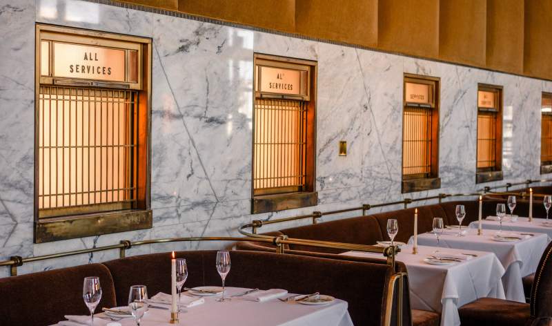
Photo: courtesy of @edandcamera
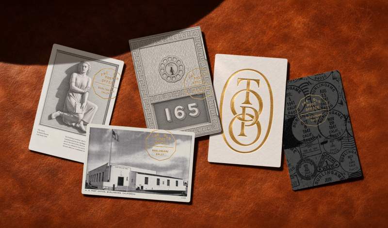
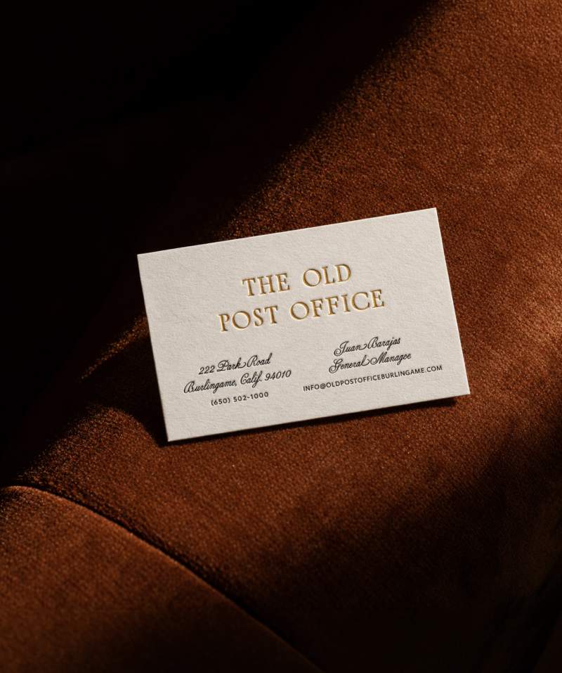
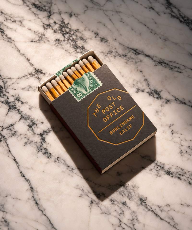
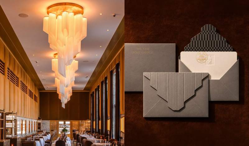
Photo: courtesy of @edandcamera
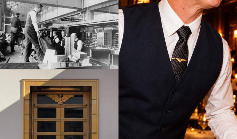
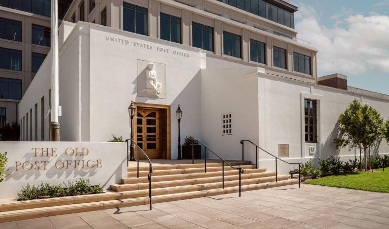
Photo: courtesy of @edandcamera